Content Craft
Stop Believing Carousel Myths: What Data Actually Shows
Loan officers hear a lot of advice about carousels—some true, most half-true, some wrong. This guide busts the myths that lead you astray so you can focus on what actually moves borrowers to engage and respond.
Myth: More Slides Always Get More Engagement
False. A tight 5-slide carousel often outperforms a rambling 10-slide one because engagement drops off after slide 5–6. People don't have unlimited patience. Platform algorithms favor carousels that get scrolled all the way to the end—meaning if people drop off at slide 6, you never hit the algorithmic bonus of 'full carousel completion.' A short, focused carousel beats a long, thorough one.
- Aim for 5–7 slides unless your topic demands more
- Measure: watch your platform analytics to see when people stop scrolling
- If most people quit at slide 5, cut anything after slide 5 and save it for a second carousel
- Tight carousels are easier to remember and repurpose later
Myth: Carousels Must Have Matching Designs
Half-true. Consistency matters (same colors, fonts, margins across slides), but rigid matching makes carousels feel robotic. Vary your visuals (photo slide, icon slide, text-only slide) while keeping the style consistent. A carousel with identical layouts slide after slide feels flat; one with varied visuals and consistent branding feels designed and intentional.
- Keep color scheme, fonts, and margins consistent
- Vary the visual content (don't use the same image template on every slide)
- One deviation per carousel is fine (a text-only slide in an otherwise image-heavy carousel)
- Consistency is about feeling like one story, not about sameness
Myth: You Need a Fancy Design Tool to Make Carousels
False. Canva, PowerPoint, or Google Slides work fine. You don't need Adobe. You need contrast, readable fonts, and one focused idea per slide. A simple design made with discipline beats a fancy design that's hard to read. Many top LOs use Canva (free templates) and post carousels that outperform designs made in professional design software.
- Canva is free and has carousel templates built-in
- PowerPoint works fine; export as images and upload to social platforms
- Google Slides is free and shareable with your team
- Fancy tools don't fix unclear ideas—focus on clarity first, tools second
Myth: Every Slide Needs an Image
False. A text-only slide with good typography and contrast can be stronger than a mediocre image. If you don't have a great image that adds meaning, use a solid color background with bold text. One-third of your carousel can be text-only and still perform well. Images should clarify your point, not fill space.
- Text-only slides work if typography is strong and contrast is good
- Use images only if they clarify your message
- A solid color background with bold text > a random stock photo
- Mix: some slides with images, some with text and color keeps it fresh
Myth: Post Carousels at Optimal Times for Maximum Reach
Half-true. Yes, timing matters, but consistency matters more. Post when your audience is most online, but posting weekly (even at non-optimal times) beats posting once monthly at the perfect time. Platforms reward consistency and fresh content, not perfect timing. Test different days and times, but don't let imperfect timing stop you from posting.
- Aim for Tuesday–Thursday, 8–10am or 5–7pm local time as starting points
- Test different times and track which gets the most early engagement
- Consistency (weekly carousels) beats perfect timing (monthly posts at optimal times)
- Repost carousels in different seasons (same carousel, different times of year)
Myth: Long Captions Get More Engagement
False. Captions that are 3–4 sentences often outperform captions that are 10+ sentences. People scan social media on phones; they don't read essays. A short, punchy caption with a clear CTA outperforms a long explanation. If you have more to say, save it for your follow-up carousel or a LinkedIn article.
- Keep captions to 3–4 sentences (100–150 words max)
- Lead with why you made the carousel ('I made this because borrowers ask...')
- Close with a clear CTA ('Reply with your biggest concern')
- Use line breaks to make captions scannable (one idea per line)
Myth: Reply CTAs Don't Work; Everyone Just Likes or Scrolls
False. Reply CTAs absolutely work if they're specific and low-friction. 'Reply with your timeline' gets more replies than 'Let me know your thoughts.' Specific asks are high-friction and low-engagement. But replies are gold because they're conversations, not vanity metrics. You'd rather have 5 genuine replies than 50 likes.
- Specific CTAs work: 'Reply with your biggest concern'
- Vague CTAs don't: 'Let me know what you think'
- Replies are conversations; track them and respond within 24 hours
- Borrowers who reply are more engaged than borrowers who like
Myth: Video Carousels (Reels) Kill Static Image Carousels
False. Both formats work. Video carousels (Reels, TikTok) reach broader audiences but are harder to produce. Static image carousels are evergreen and easier to build. Use both: static carousels on Instagram for your core audience, Reels for breadth. Don't abandon one format for the other; they're complementary.
- Static carousels: easier to produce, evergreen, save-able, strong with core audience
- Video carousels (Reels): broader reach, higher production friction, trend-dependent
- Use both: static for depth, video for breadth
- A borrower who saves your static carousel is a hotter lead than one who views your Reel
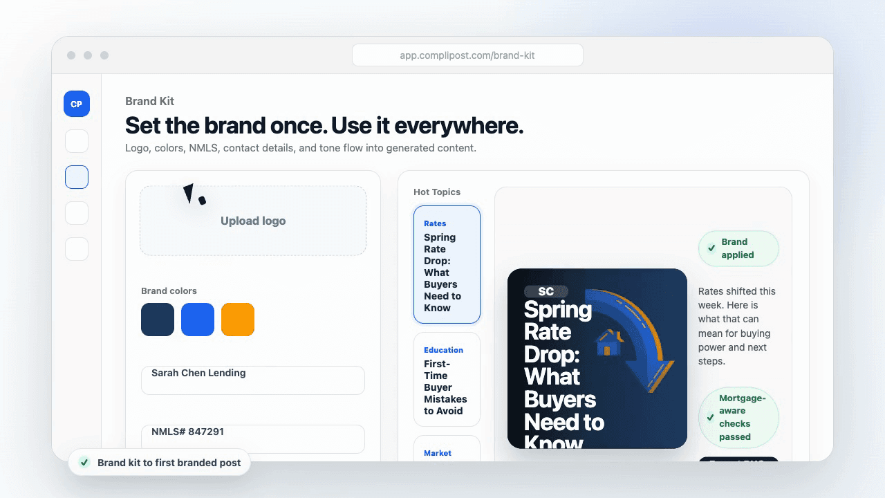
Product workflow
From blank page to export-ready mortgage content
- Start with a borrower topic
- Generate copy and a visual direction
- Review, save, and export the finished asset
These previews reflect the core CompliPost workflow: create, review, save, and export assets for use in your own channels.
Workflow comparison
| Content approach | What happens | Why it matters |
|---|---|---|
| Random posting | One-off ideas created when there is spare time | Inconsistent visibility and weak reuse |
| Template-only posting | Faster design but still requires rewriting and review | Helpful starting point, but not a full system |
| CompliPost workflow | Plan, generate, review, save, and export from one place | Better consistency with mortgage-aware review context |
| Done-for-you service | Someone else creates much of the content | Useful for some teams, but less control and less immediate reuse |
Who this guide helps
This guide is for loan officers working on solo loan officers who need a repeatable mortgage content workflow. The goal is to turn a broad mortgage topic into one borrower question, one useful takeaway, and one asset that can be reviewed before it is shared.
- You need content that sounds like a loan officer, not a generic brand account
- You want examples that can become captions, graphics, GIFs, or PDFs
- You need a clear place to review claims before export
- You want finished work saved for reuse, not lost in a chat thread
A practical workflow for this use case
Start with a narrow scenario, then move through planning, drafting, visual creation, review, and export. For carousel myths mortgage, that means the topic should be specific enough that a borrower or referral partner can immediately understand what decision the content helps with.
- Choose the borrower type, loan topic, or platform before generating copy
- Draft the caption and visual together so the asset feels cohesive
- Use the federal baseline review aid to flag claims and disclosure gaps
- Export the finished asset and save the post as a reusable starting point
What makes the content stronger
Strong mortgage content is usually specific, plain-spoken, and calm. It explains tradeoffs without pretending one answer fits every borrower. That is especially important on public social channels, where a short post can be interpreted without the full context of a loan conversation.
- Name the borrower question in the first line
- Explain one decision or tradeoff instead of covering everything
- Use examples without implying approval, savings, or rate outcomes
- End with a soft next step, checklist, or guide rather than pressure
Compliance-aware review notes
CompliPost should be treated as a review aid, not a compliance approval system. The public page, generated draft, graphic, and exported asset should all stay honest about that boundary.
- Review specific payment, APR, rate, savings, and qualification language
- Avoid “best,” “lowest,” “guaranteed,” “free,” and urgency claims unless approved
- Check NMLS, Equal Housing, company, and state-specific requirements
- Use company or legal review for anything outside the federal baseline
How this connects to the rest of CompliPost
A focused guide should leave you with a usable next step. After you understand the topic, you can turn it into a calendar slot, a reviewed social post, a downloadable guide, or a platform-specific version for the channel where your audience already spends time.
- Use the content calendar to turn the idea into a weekly plan
- Use the compliance page when claims or disclosures need a slower pass
- Use lead magnets when the topic deserves a deeper PDF guide
- Use platform pages to adapt the same idea for LinkedIn, Facebook, or Instagram
Recommended next steps
Instagram content hub
Create visual mortgage education for carousels, reels, and stories.
Carousel Structures That Convert
Structure matters more than length—pick a tight frame.
Carousel Cover-Slide Hooks
The best myth-flip carousels start with a strong hook.
Carousel Design Basics
Clarity beats fancy design every time.
Examples
FAQ
If more slides don't help, why do platforms offer 10+ slide carousels?+
Platforms offer the feature for users who genuinely need it (education, long-form storytelling, documentation). But for social-first mortgage content, tight is better. Use the 10-slide option when you have 10 ideas worth sharing; don't force ideas just because you can.
What if my carousel idea feels like it needs 8 slides?+
It probably needs 2 carousels. If slide 1–4 are one idea and slide 5–8 are a different idea, split them. Two tight carousels perform better than one long one, and you get two chances to reach your audience.
Should I ignore platform analytics and just post when I feel like it?+
No. Look at your analytics after 10 carousels and see which days/times get the most early engagement (clicks in the first hour). Then post at that time. But don't let perfect timing stop you from posting. Consistency beats perfection.
Is it true that carousels don't get as much reach as single-image posts?+
It depends on the platform. Instagram's algorithm rewards carousel completion, so carousels can perform as well as single-image posts if they're strong. LinkedIn's algorithm isn't carousel-specific. Test both formats and measure.
Should I stop using video carousels if they're harder to produce?+
Not unless you want to. Video carousels (Reels, TikTok) require more effort but reach broader audiences. If you have capacity, do both. If you're strapped for time, static carousels give you more return per hour spent.
Create mortgage content with a calmer workflow
CompliPost helps you plan, generate, review, save, and export useful mortgage content without pretending compliance or social distribution is automatic.
Start free