Content Craft
Design Your Carousel Slides for Readability and Impact
You don't need design skills to build a carousel that stops the scroll. You need three things: contrast between text and background, readable fonts, and consistent layout. This guide gives you the rules—not the software. Apply them in Canva, PowerPoint, or any tool you use, and your carousel will look professional and feel cohesive.
Rule 1: Contrast Is Non-Negotiable
Dark text on light backgrounds or light text on dark backgrounds. That's it. Never use dark text on a dark background or light text on a light background—it's unreadable on small screens. If you're using an image as a background, add a dark overlay or a text-safe box behind your words so the text stands out. Contrast is the difference between a carousel people read and a carousel people scroll past.
- Test your color contrast using a tool like WebAIM Contrast Checker (free online)
- Dark text (black or dark gray) on light backgrounds (white, light gray, light blue) is safest
- Light text (white, light yellow) on dark backgrounds (dark blue, dark gray, black) is also safe
- Avoid medium-gray text on medium-gray backgrounds, even if it looks good on your big monitor
Rule 2: Font Choice and Size
Use simple, sans-serif fonts (Helvetica, Arial, Open Sans, Montserrat) because they're legible on small phone screens. Avoid thin fonts and ornate fonts—they blur and disappear at small sizes. Make your headline 36+ points and body text 18+ points when the slide is being viewed on a phone. If you have to squint on your phone, your borrowers will too.
- Stick to one or two fonts per carousel (consistency matters)
- Headline font: 36–48 points, bold or semi-bold
- Body text: 18–24 points, regular weight
- Avoid all-caps unless it's a short label (emphasis gets lost)
- Test every slide on your actual phone before posting
Rule 3: White Space and Layout
Don't cram your slide. Leave margins around your text, use line breaks to separate ideas, and keep one main point per slide. A cluttered slide feels overwhelming and reads slowly. A clean slide with breathing room feels trustworthy and professional. You have multiple slides—use them. One idea per slide is better than three ideas packed into one.
- Leave at least 20% margin around all edges of your slide
- Use line breaks and spacing to separate headline from body text
- One primary idea per slide; supporting details are optional
- Avoid text wrapping beyond 3 lines if possible (longer paragraphs don't scan well)
- Use bullet points or numbered lists to break up information
Rule 4: Color Consistency and Branding
Use the same color scheme (2–3 colors) across all slides in your carousel. Pick a primary color (your brand color), a secondary color (for accents or highlights), and a neutral color (for backgrounds and text). Consistency makes your carousel feel like one cohesive story, not a random collection of images. If you have brand colors (a logo color, corporate blue, etc.), use them.
- Choose 2–3 colors and stick to them across all carousel slides
- Use a brand color for headlines or section backgrounds if you have a brand
- Use neutral colors (white, light gray, dark gray, black) for backgrounds and body text
- Test your color combo on a phone screen—colors look different on small screens than on your monitor
Rule 5: Images and Visual Elements
If you use images, make sure they're relevant and high-quality. Blurry or irrelevant images hurt credibility. If you don't have good images, use simple colored blocks or icons instead—clean simplicity beats poor-quality visuals. Pair your headline with one visual per slide (image, icon, or solid color block), not both plus text.
- Use high-resolution images (at least 1080 x 1080 pixels for Instagram)
- One visual per slide; don't mix a background image with multiple icons
- Use stock photos (Unsplash, Pexels) for free, high-quality images of houses, documents, people
- Add alt text to images for accessibility and SEO
- If an image doesn't clarify your point, leave it out
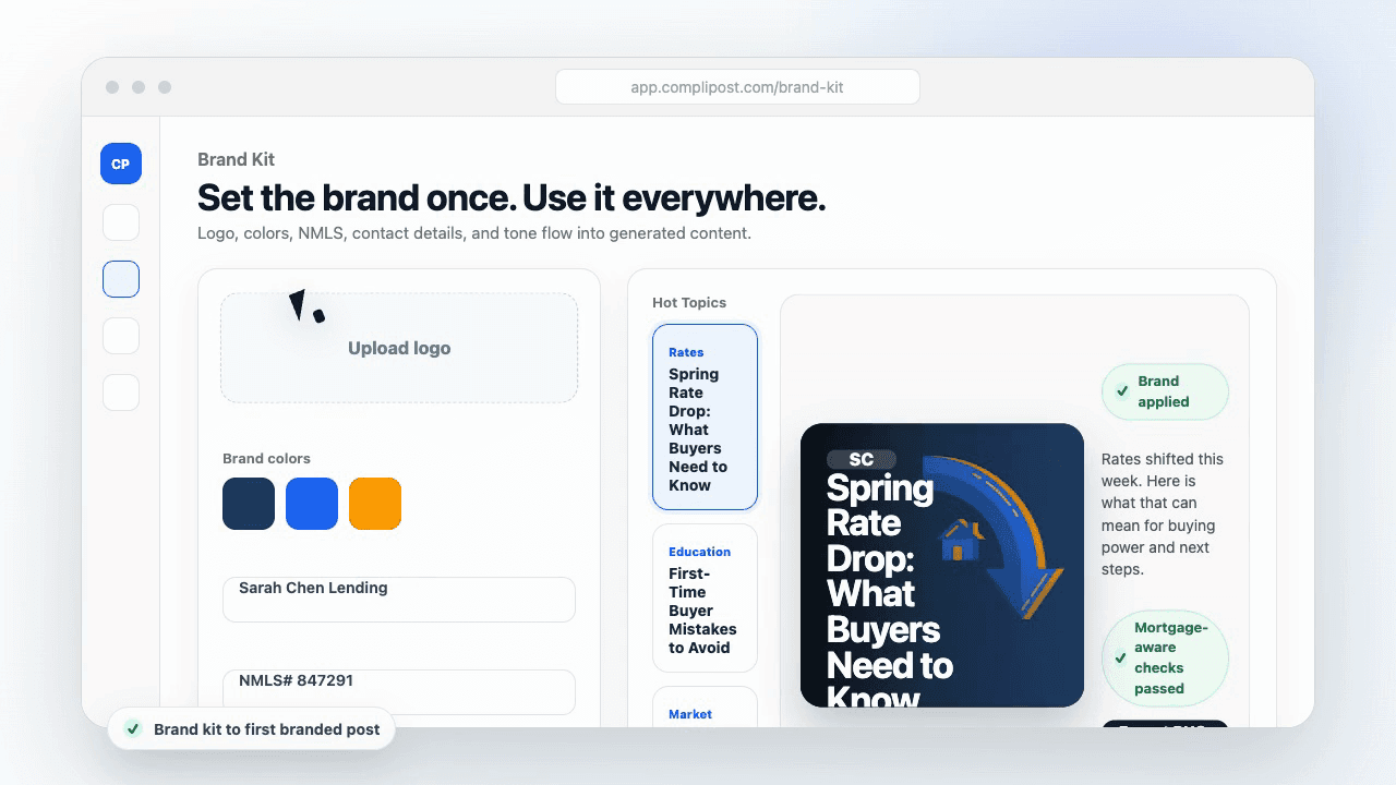
Product workflow
From blank page to export-ready mortgage content
- Start with a borrower topic
- Generate copy and a visual direction
- Review, save, and export the finished asset
These previews reflect the core CompliPost workflow: create, review, save, and export assets for use in your own channels.
Workflow comparison
| Content approach | What happens | Why it matters |
|---|---|---|
| Random posting | One-off ideas created when there is spare time | Inconsistent visibility and weak reuse |
| Template-only posting | Faster design but still requires rewriting and review | Helpful starting point, but not a full system |
| CompliPost workflow | Plan, generate, review, save, and export from one place | Better consistency with mortgage-aware review context |
| Done-for-you service | Someone else creates much of the content | Useful for some teams, but less control and less immediate reuse |
Who this guide helps
This guide is for loan officers working on solo loan officers who need a repeatable mortgage content workflow. The goal is to turn a broad mortgage topic into one borrower question, one useful takeaway, and one asset that can be reviewed before it is shared.
- You need content that sounds like a loan officer, not a generic brand account
- You want examples that can become captions, graphics, GIFs, or PDFs
- You need a clear place to review claims before export
- You want finished work saved for reuse, not lost in a chat thread
A practical workflow for this use case
Start with a narrow scenario, then move through planning, drafting, visual creation, review, and export. For carousel design readability, that means the topic should be specific enough that a borrower or referral partner can immediately understand what decision the content helps with.
- Choose the borrower type, loan topic, or platform before generating copy
- Draft the caption and visual together so the asset feels cohesive
- Use the federal baseline review aid to flag claims and disclosure gaps
- Export the finished asset and save the post as a reusable starting point
What makes the content stronger
Strong mortgage content is usually specific, plain-spoken, and calm. It explains tradeoffs without pretending one answer fits every borrower. That is especially important on public social channels, where a short post can be interpreted without the full context of a loan conversation.
- Name the borrower question in the first line
- Explain one decision or tradeoff instead of covering everything
- Use examples without implying approval, savings, or rate outcomes
- End with a soft next step, checklist, or guide rather than pressure
Compliance-aware review notes
CompliPost should be treated as a review aid, not a compliance approval system. The public page, generated draft, graphic, and exported asset should all stay honest about that boundary.
- Review specific payment, APR, rate, savings, and qualification language
- Avoid “best,” “lowest,” “guaranteed,” “free,” and urgency claims unless approved
- Check NMLS, Equal Housing, company, and state-specific requirements
- Use company or legal review for anything outside the federal baseline
How this connects to the rest of CompliPost
A focused guide should leave you with a usable next step. After you understand the topic, you can turn it into a calendar slot, a reviewed social post, a downloadable guide, or a platform-specific version for the channel where your audience already spends time.
- Use the content calendar to turn the idea into a weekly plan
- Use the compliance page when claims or disclosures need a slower pass
- Use lead magnets when the topic deserves a deeper PDF guide
- Use platform pages to adapt the same idea for LinkedIn, Facebook, or Instagram
Recommended next steps
Instagram content hub
Create visual mortgage education for carousels, reels, and stories.
Carousel Structures That Convert
Good structure + good design = strong carousel.
Carousel Cover-Slide Hooks
Your cover slide design must match the strength of your hook.
Graphic Design for Social Posts
Deep dive into contrast, typography, and color theory for social content.
Examples
FAQ
Can I use a fancy font to stand out?+
Only in very small doses—a headline in a fancy script font, surrounded by simple sans-serif body text, can work. But the body text and most of your carousel must use simple, readable fonts. Fancy fonts feel creative on your desktop and unreadable on a phone. Test on your phone first.
What if my brand colors don't have enough contrast?+
Adjust them. If your brand blue is too light to read on a white background, use a darker shade of blue. Contrast (readability) always trumps perfect brand compliance. A carousel nobody can read is worse than a carousel with a slightly adjusted color.
Should every slide in my carousel look identical?+
Use a consistent template (same colors, fonts, layout), but vary the images or visual elements slide to slide so the carousel doesn't feel monotonous. Think: same style, different content. The cover slide might have a different layout than the body slides, and that's fine—just keep the overall look cohesive.
How do I know if my carousel looks good on a phone?+
The best test is to show it to someone on their phone (or view it on your own phone) before posting. If you can read every headline and body text without squinting or zooming, you're good. If you have to zoom in or tilt the screen, resize and simplify.
Can I use animations or gradients in my carousel?+
Simple gradients (a subtle fade from one color to another) are fine and can add polish. Animations are tricky because not all platforms support them, and they can slow down the carousel load. Keep it simple: solid colors and static text. If you want movement, save it for video-carousel formats like TikTok or Reels.
Create mortgage content with a calmer workflow
CompliPost helps you plan, generate, review, save, and export useful mortgage content without pretending compliance or social distribution is automatic.
Start free